Showing posts with label Feedback. Show all posts

Saturday, 19 February 2011

Extra Poster feedback.

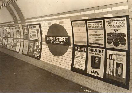
They liked the colours that Patrick and Piyal had used, that its like a poster what could cheaply be mass produced and looks like the posters that see in the Londons underground!.
Something a bit like this. ( I know its an old pic, but it shows the general idea)
They liked the style of font that they used, and commented on its consistance and suitability to the poster.
They also liked the effect that the had used, which made the effect on the cloud look effective for the poster.
The feedback me and Conor gave (but not noted)
We felt there should be some bit of colour, we suggested that maybe the red flashing light of the bomb should be at the bottom (in the dark middle bit).. which could like give a little glow to some of the writing at the bottom, which will give it that extra something. 

As Patrick has already noted about, we said about having an action shot, but didnt go into further about it. We suggested an action shot, to show the audience what type of film it is, to give excitement and tension to the poster. We suggested shots such as like the main MI5 agen (the protagonist) in a running motion, but this could still be a silhouette in just one colour, to stick with the theme.. Or it could be like a a speeding car, the brief case, just something to give a little about the storyline away.

The big group of text in the middle of the poster should be moved to somewhere not at the center of the picture, which draws the audience to that, which isn't very important. On posters normally its like tucked away at the bottom, so it includes it but the audience isn't drawn to it.

But overall I thought it was a very good first draft for the poster.. Defiantly the use of the background!.. Which I'm sure will be in the final poster.

Written up on behalf of the whole group.. MS

Wednesday, 15 December 2010

First Draft feedback

Today we showed a VERY rough draft of our teaser to the rest of the class. To get feeback on how we could improve. Here is what was suggested...

It was suggested that we maybe not include the production title logos at the beginning, beliving that teaser trailers don't include them, however from the research I have found, that most do actually include them and normally at the beginning. I also think it shows editing skills.

During the chase scene, some were left confused at the editing of the shots, that perhaps we should do an over the shoulder shot (show more of the person against the walls face). We explained we had framed it like this as we had filmed it in Oxford, but wanted to imply it was a London location, we felt that if we showed too much, that it may be clear that its not in London..

The bomber walking into the building. The choice of clothing was considered not appropiate, that he should of actually been in a suit, looking more office like.

Include transitions to change from one shot to another. E.g. Zooming in on something on one clip, then zooming out of something the same colour. E.g like how we did in our AS prelim task where, we opened the brief case onto the camera to a black out so we could include the titles over. SHMOOOTH.

Fast paced with a beat music was also suggested.

Using a digital clock.. Although this has always been our original idea, to include the clock ticking throughout, with the sound of the beap, and like a heart beat.

It was also thought we could include some kind of tint to images, e.g a green tint to connote action, or a red tint to connote danger..

This is all valuable feedback, what we will use to improve our text.

Yours Sincerly MS