okay.. So today Connor and I today presented what we had done with the website to the class, so heres the feedback we got from the media class (There will be further feedback when soon, when we get replies to our questionairre..
1. Looks much better than what it did before.
2. Get rid of the red bar at the bottom..
3. position the count down timer in like a bomb image..
4. Have a red boarder round the main content of the page
5. Position the social networking buttons better.
6.The font looks really good
7. The roll over images are good.
The right Honourable MS... and CW
Do not view this website in Internet explorer, otherwise the drop down menus won't work!!
Showing posts with label Website research. Show all posts
Showing posts with label Website research. Show all posts
Thursday, 24 March 2011

Thursday, 3 March 2011
Website research (True Grit)
So right from the off http://www.truegritmovie.com/intl/uk/index.php (The website for the film True Grit) you are subjected to the movies soundtrack, shortly after you are confronted with the Trailer for the film and then after you have dismissed/closed this it has a continuous soundtrack continuing from the film.

Asides from the music the website is pretty simple, it has links to Reviews, Photography and the other standard things from movie websites and it is a very generic film website.
Asides from the music the website is pretty simple, it has links to Reviews, Photography and the other standard things from movie websites and it is a very generic film website.
Things I like:
The Slogan ''Punishment comes in one way or another'' which fits nicely with the soundtrack which has the like ''Tell em' a gods gonna cut em' down'' and the typography of which is very good.
The dynamic bulletholes which you see appear on the website with blood coming out of them.
Things I dont like: It is very generic and it has all the things which other websites have.
BUT, what this means for our project is that we don't nessacerily have to deviate from this standard form for a website and just change it according to our genre. but also we can add more things specific to our film which could even set us ahead of the quality of this particular production
CW, happy MS?
The Slogan ''Punishment comes in one way or another'' which fits nicely with the soundtrack which has the like ''Tell em' a gods gonna cut em' down'' and the typography of which is very good.
The dynamic bulletholes which you see appear on the website with blood coming out of them.
Things I dont like: It is very generic and it has all the things which other websites have.
BUT, what this means for our project is that we don't nessacerily have to deviate from this standard form for a website and just change it according to our genre. but also we can add more things specific to our film which could even set us ahead of the quality of this particular production
CW, happy MS?
Wednesday, 23 February 2011
Four Lions Website Research
Carrying on with my research into the designs, layout and styles of websites, I decided to take a look at 'Four Lions' Its not really our genre, its more of a comedy, but its an Action Comedy, so its close enough!..

YAY!.. On the outside it looks like a much more realistic website to make for us, than what the other 2 websites I have analyzed so far.
The main thing what catches your eye straight away is the large image of the creepy crow with a bomb attached to it looking around, its a little fuzzy being a flash video on repeat. The image is meant to add to the genre of the film being a comedy, but it gives me the shivers!.. It would of been cool if like you could interact with the Crow, like the head would follow the mouse around, or you could click on it and it will flap its wings and squark at you.. Thats always fun for a few minutes at least!
The content of the page all flys on from the sides into the final positions, the text does dissolve in before flying accross though but its a very quick process. Shmooth.
On the homepage there is very little information, and all the content it does have is majority in the middle of the screen. It is largely dominated by a bright green Radial gradient with the white center making the content in the page more reader friendly. The designers of the site have played the risk card, using a slightly darker green colour for the links, which works well, just.. the last link (Reviews) you can just about see. The links are slightly different to the other websites I have looked at, having a where to watch link.. (Do people need to be told that)..As with the other films websites, it also incorporates rollover text links, what change colour when mouse is hovering over them. The website also like the others they center and try and direct the audience to buy the dvd/blu ray.. (Do people really check film websites, if they want to buy it, surely if they were looking to buy, they would just go straight to Amazon)..
The whole site is just ONE page, clicking on the page, just changes the content on the page, well not the whole page, the main image of the crow remains there looking around in the same place, while the title and the buying the dvd/ blu ray image move to the top of the page, while 'On DVD and blu-Ray August 30' and the link bar moves down, to make way for the content go into the middle of it. Clever.

 Right next to the title are 4 black silhouette images of 4 still action shots, Exciting.. but not only that, placing your mouse over an individual image, and BAM.. the individual image does a little action.
The first guy with a rocket launcher- fires a rocket up and past the Crow.
The second guy, sitting.. rasises his arm up..
The third guy, with the briefcase does a crazy little run..
The fourth guy, fires a cartridge of bullets into the air..
Now this links with the film because these actions actually happen in the film. So its not just any random images, its a marks and spencers image.. ha no but they are related images and actions.
Sooo.. Its Half term, yet I've the only one who posted on this blog.. wheres the commitment lads!! MS

YAY!.. On the outside it looks like a much more realistic website to make for us, than what the other 2 websites I have analyzed so far.
The main thing what catches your eye straight away is the large image of the creepy crow with a bomb attached to it looking around, its a little fuzzy being a flash video on repeat. The image is meant to add to the genre of the film being a comedy, but it gives me the shivers!.. It would of been cool if like you could interact with the Crow, like the head would follow the mouse around, or you could click on it and it will flap its wings and squark at you.. Thats always fun for a few minutes at least!
The content of the page all flys on from the sides into the final positions, the text does dissolve in before flying accross though but its a very quick process. Shmooth.
On the homepage there is very little information, and all the content it does have is majority in the middle of the screen. It is largely dominated by a bright green Radial gradient with the white center making the content in the page more reader friendly. The designers of the site have played the risk card, using a slightly darker green colour for the links, which works well, just.. the last link (Reviews) you can just about see. The links are slightly different to the other websites I have looked at, having a where to watch link.. (Do people need to be told that)..As with the other films websites, it also incorporates rollover text links, what change colour when mouse is hovering over them. The website also like the others they center and try and direct the audience to buy the dvd/blu ray.. (Do people really check film websites, if they want to buy it, surely if they were looking to buy, they would just go straight to Amazon)..
The whole site is just ONE page, clicking on the page, just changes the content on the page, well not the whole page, the main image of the crow remains there looking around in the same place, while the title and the buying the dvd/ blu ray image move to the top of the page, while 'On DVD and blu-Ray August 30' and the link bar moves down, to make way for the content go into the middle of it. Clever.

The first guy with a rocket launcher- fires a rocket up and past the Crow.
The second guy, sitting.. rasises his arm up..
The third guy, with the briefcase does a crazy little run..
The fourth guy, fires a cartridge of bullets into the air..
Now this links with the film because these actions actually happen in the film. So its not just any random images, its a marks and spencers image.. ha no but they are related images and actions.
Sooo.. Its Half term, yet I've the only one who posted on this blog.. wheres the commitment lads!! MS
Monday, 21 February 2011
Green Zone movie website
http://www.greenzonemovie.com/
Now Green zone has a very clever site. On arrival to the page, you are welcomed by a welcome page, a page.

The clever people among you will notice, that I had to some considerable zooming out to give more of an idea of what treasures this website beholds. Its different to a normal welcome page you normally get on websites, in the fact it has a whole load of content on it.. Basically all the content on the separate pages put into one, so for lazy people who don't like clicking on links, they can view it all on one page... Clever.
The page uses an action shot background in the top half of the screen, with the protagonist character on the left and 3 smaller seperate action shots on the right, split up with the information.
Heading the page it has the attention grabbing text, the name of the film, the famous world known films previously directed by the director - connoting to the audience that the film will be good, further backed up by detailing the award winning actor in the film.
The link bar then has links for the photo gallery, synopsis, cast, product features and a link to enter the site.. Not that you need to enter it to get any more content.
As like many other film websites it tries its hard sells on the audience, with the trailer in the middle and telling them all about the discs that they can buy, so that they can watch it at home!.. Yay.
Then it goes about and has all the content from the website, in there only little compartments with a different background image behind each one. Fancy.
On apparently clicking on the button to enter the site..
after some loading site nonsense.


You get to the main sites homepage, which is just a fancy flash version really. In keeping with the synoposis of the film, the viewer is presented with a green radar map, where the user can choose where they want to go on the site... Ohhh interactive!.. They clearly have money to burn. Good colour co-ordination skills though!..
So far what I have been finding out from researching websites, are that they are all fancy, and interactive, made using lots of different programming languages, like flash and JavaScript, I for one can't code in them.. I can do HTML and supposedly I can programme in php.. But Im sure My computing teacher will tell you that Im not very good at it!!
Actions movie websites, tend to use little array of colours.. they stick with a certain number of colours.. round about 5.
But I have learnt how the websites are layed out and how they have a relevant background image, and how the centre of attention is on the trailer and buying the dvd/ Blu Ray...
Having text but pictures too.. because no one likes to read a busy website!..
Reporting for duty, actually wait I've already reported for duty.. MS
Now Green zone has a very clever site. On arrival to the page, you are welcomed by a welcome page, a page.

The clever people among you will notice, that I had to some considerable zooming out to give more of an idea of what treasures this website beholds. Its different to a normal welcome page you normally get on websites, in the fact it has a whole load of content on it.. Basically all the content on the separate pages put into one, so for lazy people who don't like clicking on links, they can view it all on one page... Clever.
The page uses an action shot background in the top half of the screen, with the protagonist character on the left and 3 smaller seperate action shots on the right, split up with the information.
Heading the page it has the attention grabbing text, the name of the film, the famous world known films previously directed by the director - connoting to the audience that the film will be good, further backed up by detailing the award winning actor in the film.
The link bar then has links for the photo gallery, synopsis, cast, product features and a link to enter the site.. Not that you need to enter it to get any more content.
As like many other film websites it tries its hard sells on the audience, with the trailer in the middle and telling them all about the discs that they can buy, so that they can watch it at home!.. Yay.
Then it goes about and has all the content from the website, in there only little compartments with a different background image behind each one. Fancy.
On apparently clicking on the button to enter the site..
after some loading site nonsense.


You get to the main sites homepage, which is just a fancy flash version really. In keeping with the synoposis of the film, the viewer is presented with a green radar map, where the user can choose where they want to go on the site... Ohhh interactive!.. They clearly have money to burn. Good colour co-ordination skills though!..
So far what I have been finding out from researching websites, are that they are all fancy, and interactive, made using lots of different programming languages, like flash and JavaScript, I for one can't code in them.. I can do HTML and supposedly I can programme in php.. But Im sure My computing teacher will tell you that Im not very good at it!!
Actions movie websites, tend to use little array of colours.. they stick with a certain number of colours.. round about 5.
But I have learnt how the websites are layed out and how they have a relevant background image, and how the centre of attention is on the trailer and buying the dvd/ Blu Ray...
Having text but pictures too.. because no one likes to read a busy website!..
Reporting for duty, actually wait I've already reported for duty.. MS
Saturday, 19 February 2011
Unstoppable movie FAIL
Okay So Carrying on with my website research! I thought I would have a look at a similar film to ours.
'Unstoppable'!.. So you know google was finding it for me, so I was like Hmm WIKI will show me where to go, and there at the bottom, it says 'Official website' and in the bottom bar.. it tells me http://www.unstoppablemovie.com/ .. So I said YAY to myself and clicked on it.. and then expecting to see an amazing flash website. But NOO.. I am taken to to there site on Amazon.. umm what, Pesky Wikipedia uploaders.
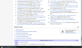 but I persisted and carried on looking using there facebook website! But there it linked me to the same site.
So basically www.unstoppablemovie.com just auto directs the audience to Amazon. The only reason I can think why they would do that, is just to save money on getting people to code a website for them, which is just a poor excuse, its like trying to force people to buy the Blu Ray!.. I'm pretty sure DVD is still more popular than Blue Ray! If people wanted to buy it then, they would just Amazon search it themselves.. they don't need to be directed there!.. GAH!..
 ^^ YOU FAIL UNSTOPPABLE! love from a disgruntled customer! MS
'Unstoppable'!.. So you know google was finding it for me, so I was like Hmm WIKI will show me where to go, and there at the bottom, it says 'Official website' and in the bottom bar.. it tells me http://www.unstoppablemovie.com/ .. So I said YAY to myself and clicked on it.. and then expecting to see an amazing flash website. But NOO.. I am taken to to there site on Amazon.. umm what, Pesky Wikipedia uploaders.

So basically www.unstoppablemovie.com just auto directs the audience to Amazon. The only reason I can think why they would do that, is just to save money on getting people to code a website for them, which is just a poor excuse, its like trying to force people to buy the Blu Ray!.. I'm pretty sure DVD is still more popular than Blue Ray! If people wanted to buy it then, they would just Amazon search it themselves.. they don't need to be directed there!.. GAH!..

The Other Guys website research.
So I'm back to talking about my favourite film at the moment, The Other guys, but not just the other guys, but the other guys website!.. Now this is a fancy flashy, lots of movement website.
The website starts with a full screnflash video of the motion poster I mentioned in a post before. Which can be skipped if you wanted to.
It then ends up on here..

The main image is of the main 2 protagonist characters of the film. Will Ferrell and Mark Wahlberg, this image takes up the majority of the screen (It also is the image that they use on the film posters.) The smoke effect in the background is constantly moving while the characters in the foreground are static)
The website also shows the title of the film in large noticeable font, just incase the people viewing the website, don't know what website it is.. It also has the names of Mark Wahlberg and Will Ferrell above, and below the title, it has about the dvd and blueray.
In the top left corner of the website it has a featured box, which is basically a quick link to the trailer. The way they have presented this, shows that its what they most want you to look at.
The link bar contains the links.. 'About the film'... 'Videos'... 'Photos'.. 'Downloads'... 'Cadet Academy'... 'Twitter game'
When your mouse rolls over, the links on the page the text of the link becomes white but also it has a roll over sound what sounds like a gun jamming. (so you can make a cool little tune when moving the mouse over the links.. yeah!) But if it annoys you, what I'm sure it could the site lets you mute it. Also for 'About the film' on roll over you get a horizontal drop down menu.. below 'Story'.. 'Cast'.. 'Crew'
Facebook has taken the internet by storm, with 500 million active users on facebook, the website can get more visitors to their site, by including a 'Like' button what connects with the audiences facebooks, where the like will show up on there profile so that there friends. They also have share buttons for some of the internets social network sites, to share the link on there. This can also increase there audience, The clever thing with this is that its a form of advertising without having to pay!.. Clever!..
When clicking on view trailer.. it darkens the screen and pop ups a flash video player.. which remains dead in the centre of the screen. even when scrolling!!.. Clever.

About the Film - Story

Lots of research! MS
Subscribe to:
Posts (Atom)