okay.. So today Connor and I today presented what we had done with the website to the class, so heres the feedback we got from the media class (There will be further feedback when soon, when we get replies to our questionairre..
1. Looks much better than what it did before.
2. Get rid of the red bar at the bottom..
3. position the count down timer in like a bomb image..
4. Have a red boarder round the main content of the page
5. Position the social networking buttons better.
6.The font looks really good
7. The roll over images are good.
The right Honourable MS... and CW
Do not view this website in Internet explorer, otherwise the drop down menus won't work!!
Showing posts with label MS. Show all posts
Showing posts with label MS. Show all posts
Thursday, 24 March 2011

Wednesday, 23 March 2011
Damn you after effects,. Damn you!!

Soo at the moment I have been trying to render the cctv shot from after effects and put it into Premiere.. BUTT NOOO.. it hates me! It just crashes when rendering.. AHHH!!!

Also Patricks Camera has the worst video format what my computer can't open up at all and keeps freezing premiere..
Tuesday, 22 March 2011
Filming Today
Today after school our group met up in town outside the Said Business School to re-film the walk when the bomber enters the building with his briefcase in hand. We did this due to the feedback we received once we had shown our draft to the rest of our class. They felt Conor had a limp in his walk in this scene which was a distraction to them focussing on the teaser trailer. We therefore filmed the scene again with a different actor (who didn't have a limp) making improvements to the quality of the shot at the same time. We also added another shot in which Conor and our other actor "Abbz" exchanging the briefcase, which will be added in before-hand.
We will now look at these shots on the computer and see if we can make them work together. Also some plans Matty and myself have talked about involve a possible zoom in black-out for one of the titles to show good transition skills.
Post by PG
Filming: Happy Birthday MS, PM and CW
We will now look at these shots on the computer and see if we can make them work together. Also some plans Matty and myself have talked about involve a possible zoom in black-out for one of the titles to show good transition skills.
Post by PG
Filming: Happy Birthday MS, PM and CW
Wednesday, 23 February 2011
Four Lions Website Research
Carrying on with my research into the designs, layout and styles of websites, I decided to take a look at 'Four Lions' Its not really our genre, its more of a comedy, but its an Action Comedy, so its close enough!..

YAY!.. On the outside it looks like a much more realistic website to make for us, than what the other 2 websites I have analyzed so far.
The main thing what catches your eye straight away is the large image of the creepy crow with a bomb attached to it looking around, its a little fuzzy being a flash video on repeat. The image is meant to add to the genre of the film being a comedy, but it gives me the shivers!.. It would of been cool if like you could interact with the Crow, like the head would follow the mouse around, or you could click on it and it will flap its wings and squark at you.. Thats always fun for a few minutes at least!
The content of the page all flys on from the sides into the final positions, the text does dissolve in before flying accross though but its a very quick process. Shmooth.
On the homepage there is very little information, and all the content it does have is majority in the middle of the screen. It is largely dominated by a bright green Radial gradient with the white center making the content in the page more reader friendly. The designers of the site have played the risk card, using a slightly darker green colour for the links, which works well, just.. the last link (Reviews) you can just about see. The links are slightly different to the other websites I have looked at, having a where to watch link.. (Do people need to be told that)..As with the other films websites, it also incorporates rollover text links, what change colour when mouse is hovering over them. The website also like the others they center and try and direct the audience to buy the dvd/blu ray.. (Do people really check film websites, if they want to buy it, surely if they were looking to buy, they would just go straight to Amazon)..
The whole site is just ONE page, clicking on the page, just changes the content on the page, well not the whole page, the main image of the crow remains there looking around in the same place, while the title and the buying the dvd/ blu ray image move to the top of the page, while 'On DVD and blu-Ray August 30' and the link bar moves down, to make way for the content go into the middle of it. Clever.

 Right next to the title are 4 black silhouette images of 4 still action shots, Exciting.. but not only that, placing your mouse over an individual image, and BAM.. the individual image does a little action.
The first guy with a rocket launcher- fires a rocket up and past the Crow.
The second guy, sitting.. rasises his arm up..
The third guy, with the briefcase does a crazy little run..
The fourth guy, fires a cartridge of bullets into the air..
Now this links with the film because these actions actually happen in the film. So its not just any random images, its a marks and spencers image.. ha no but they are related images and actions.
Sooo.. Its Half term, yet I've the only one who posted on this blog.. wheres the commitment lads!! MS

YAY!.. On the outside it looks like a much more realistic website to make for us, than what the other 2 websites I have analyzed so far.
The main thing what catches your eye straight away is the large image of the creepy crow with a bomb attached to it looking around, its a little fuzzy being a flash video on repeat. The image is meant to add to the genre of the film being a comedy, but it gives me the shivers!.. It would of been cool if like you could interact with the Crow, like the head would follow the mouse around, or you could click on it and it will flap its wings and squark at you.. Thats always fun for a few minutes at least!
The content of the page all flys on from the sides into the final positions, the text does dissolve in before flying accross though but its a very quick process. Shmooth.
On the homepage there is very little information, and all the content it does have is majority in the middle of the screen. It is largely dominated by a bright green Radial gradient with the white center making the content in the page more reader friendly. The designers of the site have played the risk card, using a slightly darker green colour for the links, which works well, just.. the last link (Reviews) you can just about see. The links are slightly different to the other websites I have looked at, having a where to watch link.. (Do people need to be told that)..As with the other films websites, it also incorporates rollover text links, what change colour when mouse is hovering over them. The website also like the others they center and try and direct the audience to buy the dvd/blu ray.. (Do people really check film websites, if they want to buy it, surely if they were looking to buy, they would just go straight to Amazon)..
The whole site is just ONE page, clicking on the page, just changes the content on the page, well not the whole page, the main image of the crow remains there looking around in the same place, while the title and the buying the dvd/ blu ray image move to the top of the page, while 'On DVD and blu-Ray August 30' and the link bar moves down, to make way for the content go into the middle of it. Clever.

The first guy with a rocket launcher- fires a rocket up and past the Crow.
The second guy, sitting.. rasises his arm up..
The third guy, with the briefcase does a crazy little run..
The fourth guy, fires a cartridge of bullets into the air..
Now this links with the film because these actions actually happen in the film. So its not just any random images, its a marks and spencers image.. ha no but they are related images and actions.
Sooo.. Its Half term, yet I've the only one who posted on this blog.. wheres the commitment lads!! MS
Monday, 21 February 2011
Green Zone movie website
http://www.greenzonemovie.com/
Now Green zone has a very clever site. On arrival to the page, you are welcomed by a welcome page, a page.

The clever people among you will notice, that I had to some considerable zooming out to give more of an idea of what treasures this website beholds. Its different to a normal welcome page you normally get on websites, in the fact it has a whole load of content on it.. Basically all the content on the separate pages put into one, so for lazy people who don't like clicking on links, they can view it all on one page... Clever.
The page uses an action shot background in the top half of the screen, with the protagonist character on the left and 3 smaller seperate action shots on the right, split up with the information.
Heading the page it has the attention grabbing text, the name of the film, the famous world known films previously directed by the director - connoting to the audience that the film will be good, further backed up by detailing the award winning actor in the film.
The link bar then has links for the photo gallery, synopsis, cast, product features and a link to enter the site.. Not that you need to enter it to get any more content.
As like many other film websites it tries its hard sells on the audience, with the trailer in the middle and telling them all about the discs that they can buy, so that they can watch it at home!.. Yay.
Then it goes about and has all the content from the website, in there only little compartments with a different background image behind each one. Fancy.
On apparently clicking on the button to enter the site..
after some loading site nonsense.


You get to the main sites homepage, which is just a fancy flash version really. In keeping with the synoposis of the film, the viewer is presented with a green radar map, where the user can choose where they want to go on the site... Ohhh interactive!.. They clearly have money to burn. Good colour co-ordination skills though!..
So far what I have been finding out from researching websites, are that they are all fancy, and interactive, made using lots of different programming languages, like flash and JavaScript, I for one can't code in them.. I can do HTML and supposedly I can programme in php.. But Im sure My computing teacher will tell you that Im not very good at it!!
Actions movie websites, tend to use little array of colours.. they stick with a certain number of colours.. round about 5.
But I have learnt how the websites are layed out and how they have a relevant background image, and how the centre of attention is on the trailer and buying the dvd/ Blu Ray...
Having text but pictures too.. because no one likes to read a busy website!..
Reporting for duty, actually wait I've already reported for duty.. MS
Now Green zone has a very clever site. On arrival to the page, you are welcomed by a welcome page, a page.

The clever people among you will notice, that I had to some considerable zooming out to give more of an idea of what treasures this website beholds. Its different to a normal welcome page you normally get on websites, in the fact it has a whole load of content on it.. Basically all the content on the separate pages put into one, so for lazy people who don't like clicking on links, they can view it all on one page... Clever.
The page uses an action shot background in the top half of the screen, with the protagonist character on the left and 3 smaller seperate action shots on the right, split up with the information.
Heading the page it has the attention grabbing text, the name of the film, the famous world known films previously directed by the director - connoting to the audience that the film will be good, further backed up by detailing the award winning actor in the film.
The link bar then has links for the photo gallery, synopsis, cast, product features and a link to enter the site.. Not that you need to enter it to get any more content.
As like many other film websites it tries its hard sells on the audience, with the trailer in the middle and telling them all about the discs that they can buy, so that they can watch it at home!.. Yay.
Then it goes about and has all the content from the website, in there only little compartments with a different background image behind each one. Fancy.
On apparently clicking on the button to enter the site..
after some loading site nonsense.


You get to the main sites homepage, which is just a fancy flash version really. In keeping with the synoposis of the film, the viewer is presented with a green radar map, where the user can choose where they want to go on the site... Ohhh interactive!.. They clearly have money to burn. Good colour co-ordination skills though!..
So far what I have been finding out from researching websites, are that they are all fancy, and interactive, made using lots of different programming languages, like flash and JavaScript, I for one can't code in them.. I can do HTML and supposedly I can programme in php.. But Im sure My computing teacher will tell you that Im not very good at it!!
Actions movie websites, tend to use little array of colours.. they stick with a certain number of colours.. round about 5.
But I have learnt how the websites are layed out and how they have a relevant background image, and how the centre of attention is on the trailer and buying the dvd/ Blu Ray...
Having text but pictures too.. because no one likes to read a busy website!..
Reporting for duty, actually wait I've already reported for duty.. MS
Sunday, 20 February 2011
Visual poster feedback
OK so basically, I thought Conor and I would visualise for Patrick what our feedback on his poster, and how adding a little bit of colour and an action shot could do there first draft of a poster.


So obviously this was done very quick just as an example, to show the others. But we think just the tiny but of colour we have added to this poster, gives it just that little bit extra that it was lacking.
we havent fully managed to show what we mean by having the red flashing light at the bottom ( like the flashing light you see in films with bombs).. we wanted it so that it would give some glow.. to the 'Summer 2011', which we havent quite managed in this quick attempt, but we hope they will get the idea of what we mean.. If they did think it was a good idea.. obviously it would be done alot better, than me just using shapes..
Also the action shot image of someone running, kinda works, but somethings not right about it.. we wanted it too look like the runner was coming out of the shadows.. but we're sure we can get a better picture for that, but we defiantly think its better than just having lots of text there.
At the moment, we think this draft lacks emotion, so that the audience aren't drawn into the tense emotion that the film is about, As we mentoioned about in the post about unstoppable so we think on how to improve this we could add real emotion to the poster.
Yours Faithfully - I hate that it makes people sounds like they are servants. MS and CW


So obviously this was done very quick just as an example, to show the others. But we think just the tiny but of colour we have added to this poster, gives it just that little bit extra that it was lacking.
we havent fully managed to show what we mean by having the red flashing light at the bottom ( like the flashing light you see in films with bombs).. we wanted it so that it would give some glow.. to the 'Summer 2011', which we havent quite managed in this quick attempt, but we hope they will get the idea of what we mean.. If they did think it was a good idea.. obviously it would be done alot better, than me just using shapes..
Also the action shot image of someone running, kinda works, but somethings not right about it.. we wanted it too look like the runner was coming out of the shadows.. but we're sure we can get a better picture for that, but we defiantly think its better than just having lots of text there.
At the moment, we think this draft lacks emotion, so that the audience aren't drawn into the tense emotion that the film is about, As we mentoioned about in the post about unstoppable so we think on how to improve this we could add real emotion to the poster.
Yours Faithfully - I hate that it makes people sounds like they are servants. MS and CW
Unstoppable poster
Furthering our research on posters I thought I would take a look at a Similar kind of storyline, well in the fact that its got the possibility of killing millions and that they have to try and stop it!..
 I really like the colours they have used on this poster, to me it shows a real tense action film. Whilst also drawing the audience to look at the poster, in like the same way, people are drawn to look at fire, where you just have to look at it.
For the title which is in the middle of page, which is unusual for what I have seen. But it is cleverly done, as if it is a speeding train on fire, clever!..
As what seems the norm in lots of posters I've seen the main characters are at the top.. In the same font as the title
The images used are enthralling and exciting, mixing the main characters (clearly with loads of make up and photoshopped) up with the action shots, the use of the characters not only show who they have managed to pay to do be in the film, but it adds emotion to the poster, which draws the audience into the story. And as its based on a real life story (apparently). It gives a more appealing look rather than just a top production company doing a big explosive film.
And has all the writing no one reads at the bottom.. Along with the due date..
Thats all from me for now folks. MS
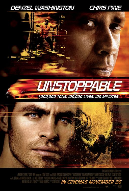
For the title which is in the middle of page, which is unusual for what I have seen. But it is cleverly done, as if it is a speeding train on fire, clever!..
As what seems the norm in lots of posters I've seen the main characters are at the top.. In the same font as the title
The images used are enthralling and exciting, mixing the main characters (clearly with loads of make up and photoshopped) up with the action shots, the use of the characters not only show who they have managed to pay to do be in the film, but it adds emotion to the poster, which draws the audience into the story. And as its based on a real life story (apparently). It gives a more appealing look rather than just a top production company doing a big explosive film.
And has all the writing no one reads at the bottom.. Along with the due date..
Thats all from me for now folks. MS
Saturday, 19 February 2011
Unstoppable movie FAIL
Okay So Carrying on with my website research! I thought I would have a look at a similar film to ours.
'Unstoppable'!.. So you know google was finding it for me, so I was like Hmm WIKI will show me where to go, and there at the bottom, it says 'Official website' and in the bottom bar.. it tells me http://www.unstoppablemovie.com/ .. So I said YAY to myself and clicked on it.. and then expecting to see an amazing flash website. But NOO.. I am taken to to there site on Amazon.. umm what, Pesky Wikipedia uploaders.
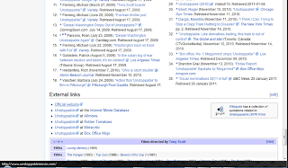 but I persisted and carried on looking using there facebook website! But there it linked me to the same site.
So basically www.unstoppablemovie.com just auto directs the audience to Amazon. The only reason I can think why they would do that, is just to save money on getting people to code a website for them, which is just a poor excuse, its like trying to force people to buy the Blu Ray!.. I'm pretty sure DVD is still more popular than Blue Ray! If people wanted to buy it then, they would just Amazon search it themselves.. they don't need to be directed there!.. GAH!..
 ^^ YOU FAIL UNSTOPPABLE! love from a disgruntled customer! MS
'Unstoppable'!.. So you know google was finding it for me, so I was like Hmm WIKI will show me where to go, and there at the bottom, it says 'Official website' and in the bottom bar.. it tells me http://www.unstoppablemovie.com/ .. So I said YAY to myself and clicked on it.. and then expecting to see an amazing flash website. But NOO.. I am taken to to there site on Amazon.. umm what, Pesky Wikipedia uploaders.

So basically www.unstoppablemovie.com just auto directs the audience to Amazon. The only reason I can think why they would do that, is just to save money on getting people to code a website for them, which is just a poor excuse, its like trying to force people to buy the Blu Ray!.. I'm pretty sure DVD is still more popular than Blue Ray! If people wanted to buy it then, they would just Amazon search it themselves.. they don't need to be directed there!.. GAH!..

The Other Guys website research.
So I'm back to talking about my favourite film at the moment, The Other guys, but not just the other guys, but the other guys website!.. Now this is a fancy flashy, lots of movement website.
The website starts with a full screnflash video of the motion poster I mentioned in a post before. Which can be skipped if you wanted to.
It then ends up on here..

The main image is of the main 2 protagonist characters of the film. Will Ferrell and Mark Wahlberg, this image takes up the majority of the screen (It also is the image that they use on the film posters.) The smoke effect in the background is constantly moving while the characters in the foreground are static)
The website also shows the title of the film in large noticeable font, just incase the people viewing the website, don't know what website it is.. It also has the names of Mark Wahlberg and Will Ferrell above, and below the title, it has about the dvd and blueray.
In the top left corner of the website it has a featured box, which is basically a quick link to the trailer. The way they have presented this, shows that its what they most want you to look at.
The link bar contains the links.. 'About the film'... 'Videos'... 'Photos'.. 'Downloads'... 'Cadet Academy'... 'Twitter game'
When your mouse rolls over, the links on the page the text of the link becomes white but also it has a roll over sound what sounds like a gun jamming. (so you can make a cool little tune when moving the mouse over the links.. yeah!) But if it annoys you, what I'm sure it could the site lets you mute it. Also for 'About the film' on roll over you get a horizontal drop down menu.. below 'Story'.. 'Cast'.. 'Crew'
Facebook has taken the internet by storm, with 500 million active users on facebook, the website can get more visitors to their site, by including a 'Like' button what connects with the audiences facebooks, where the like will show up on there profile so that there friends. They also have share buttons for some of the internets social network sites, to share the link on there. This can also increase there audience, The clever thing with this is that its a form of advertising without having to pay!.. Clever!..
When clicking on view trailer.. it darkens the screen and pop ups a flash video player.. which remains dead in the centre of the screen. even when scrolling!!.. Clever.

About the Film - Story

Lots of research! MS
Website feedback
Ok so the design we made was a very very rough quick design. So not much feedback to report on it.
The main part of our background was the building background that Patrick had made. Which not only works well with the website as well. Images were also used to create the text for the website links, this was done because the font won't work on most computers, as they don't have the font installed on the computer, so the web browser would convert the text, to some boring normal one.
So the feedback.
Conors idea is that we could include a bomb timer in the corner, counting down the days until our supposed film will be out. So we would use an image of a bomb, with a clock what counts down. We all agreed this would be a good idea, if we could work out how to do it, as it will emphasise the film.
That we should use the same font as the poster.
Have little action silhouettes.
Roll over stuff.
Have the background remain static, and have a box which scrolls down (leaving the links static at the top too)..
So thats basically all the feedback, which can defiantly be included. But more research needs to be done on websites.
Its half term- Im doing work- Amazed! MS
The main part of our background was the building background that Patrick had made. Which not only works well with the website as well. Images were also used to create the text for the website links, this was done because the font won't work on most computers, as they don't have the font installed on the computer, so the web browser would convert the text, to some boring normal one.
So the feedback.
Conors idea is that we could include a bomb timer in the corner, counting down the days until our supposed film will be out. So we would use an image of a bomb, with a clock what counts down. We all agreed this would be a good idea, if we could work out how to do it, as it will emphasise the film.
That we should use the same font as the poster.
Have little action silhouettes.
Roll over stuff.
Have the background remain static, and have a box which scrolls down (leaving the links static at the top too)..
So thats basically all the feedback, which can defiantly be included. But more research needs to be done on websites.
Its half term- Im doing work- Amazed! MS
Extra Poster feedback.
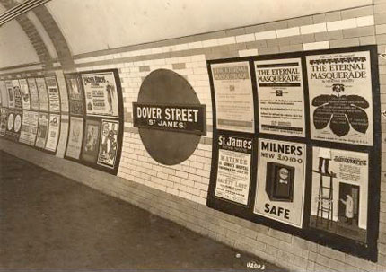
They liked the colours that Patrick and Piyal had used, that its like a poster what could cheaply be mass produced and looks like the posters that see in the Londons underground!.
Something a bit like this. ( I know its an old pic, but it shows the general idea)
Something a bit like this. ( I know its an old pic, but it shows the general idea)
They liked the style of font that they used, and commented on its consistance and suitability to the poster.
They also liked the effect that the had used, which made the effect on the cloud look effective for the poster.
The feedback me and Conor gave (but not noted)
We felt there should be some bit of colour, we suggested that maybe the red flashing light of the bomb should be at the bottom (in the dark middle bit).. which could like give a little glow to some of the writing at the bottom, which will give it that extra something.
As Patrick has already noted about, we said about having an action shot, but didnt go into further about it. We suggested an action shot, to show the audience what type of film it is, to give excitement and tension to the poster. We suggested shots such as like the main MI5 agen (the protagonist) in a running motion, but this could still be a silhouette in just one colour, to stick with the theme.. Or it could be like a a speeding car, the brief case, just something to give a little about the storyline away.
The big group of text in the middle of the poster should be moved to somewhere not at the center of the picture, which draws the audience to that, which isn't very important. On posters normally its like tucked away at the bottom, so it includes it but the audience isn't drawn to it.
But overall I thought it was a very good first draft for the poster.. Defiantly the use of the background!.. Which I'm sure will be in the final poster.
Written up on behalf of the whole group.. MS
Tuesday, 8 February 2011
website design draft 1

but yeah thats about the only good bit about it... it will need to be improved.. Its quite an artistic design..
I had to use images for the text as its not a web friendly text.. so people wouldnt be able to read it..
more designs to come!
It is also on my school computing account server.. but It only looks good on wide screens at the moment so yeah..
cshwkhub.cherwellcomputing.co.uk/media.php
Brookes have just given me an conditional offer. GET IN MS
Sunday, 30 January 2011
The Other Guys Poster
So basically we've been to start on our ancillary tasks, Our group has chosen to do a website and a poster.. So where better to start my research than with The Other Guys, which has a similar genre to ours, apart from The Other guys is also a comedy.. which I wish ours was!..
So Here is the poster you can click on it to a full size view of it..

So Here is the poster you can click on it to a full size view of it..

What the poster includes:
Title of the film - In a white bold font, which is easily noticeable as it stands out from the background.
Title of the film - In a white bold font, which is easily noticeable as it stands out from the background.
A large action shot picture in the centre of the poster. The eye catcher. The picture shows that the film is an action film without needing to say, but also a comedy by their positions and by the expression on the man in the grey suits face..
Famous actor names-the main characters in black font standing out from the background at the top of the poster.
Date of the film - Again white font what stands out in its background nestled between the companies involved and the website.
Tagline- One of 2 bits of the poster which actually has a colour. Which makes it stand out from all the text whats around it. It also gives a little taste of what the film about, in just a few words, in a way what suits the genre.
Website:.The poster has a link to a website, although this is very small and just nestled with all the company logos at the bottom of the poster. However the design of the poster has decided to focus on directing people to there page on facebook. Which suggests that more people are likely to go on their facebook site than go to the website. Thus suggesting the type of audience what might be interested in it..
Colours:. The poster mainly uses dull colours, apart from the red tie and the yellow tagline. The background is like a linear gradient going from light at the top to dark at the bottom.. with a smoke effect. As if its that action shot where an explosion has just happened behind them what you see in many action films where explosions happen.
We can defiantly take aspects of this poster for use in ours, the positioning, the colours, whats included etc.
Tuesday, 11 January 2011
Revision time!.
So at the moment the group haven't been updating the blog, due to it being exam time, so we are all focusing on revision for our exams, Well Conors probally doing revision on minecraft during the night and sleeping during the day, but thats a whole different story!. .
So basically lots of updates. I haven't done anything on my plan to create a teaser without using any 'real footage', but I will get round to that eventually after the end of January. I also had this idea, that the digital timer we are planning on using, transforms into text. e.g 00:00:01 will transform into 'whatever the title of the fom is'.. So yeah just an idea we could implement, which could make the titles look more exciting and more relevent to the genre of the film, this could also be done with the text on the poster so, its like digital number in text form.. Make sense?. .
Its also been the time of the year where all my real year people come back from uni, to come and see me!!..
So I've been to the cinema twice with them, seeing 2 very different films. Basically one being one of the worst films I've ever seen and the other being one of the best I've seen for a very long time. These 2 films are Gullivers travel and 127 hours.
I will start with the worst 127 hours.. HAAA NOOO I JOKE. The worst one is really Gullivers travel, Now I obviously didnt choose this film, despite it apparently being a comedy, just its trailers, reviews were all crap.. So ya know wasn't expecting much.. Ohh understatement of a life time there, the special effects were poor, When Gulliver was meant to be big, he never looked like he was in the scene, it was clear that it was green screening, and they even did the rule one mistake of not aligning his feet up with the floor some of the times so he was floating at times.. In comparison with this though, days after watching Gulliver, when flicking through the channels I ended up on 'Honey I blew up the kid', now incorporates similar effects, of having the child really big. But even though this was done in the 1980s the effects were amazing, they actually managed to make me feel that the child was actually in the scene and that he was actually a 50ft baby.. Why couldnt gullivers travel manage to do this?.. Also 'comedy' more like wannabe comedy, it just tried to hard to be funny it failed.. miserably. I don't think I laughed once during it.
Rant out the way, now on to the praise. 127 hours, Now I think this is a much cheaper production, not using well known stars. I also went into the cinema, being pessimistic thinking that it won't be very good because its not a comedy. But it was amazing, the story line, the realism, the simplicity of it all. It felt like a home movie in a good way, that you could really relate, really connect with the characters.. Now at times just him being stuck in a hole with a boulder trapping him, did drag on.. One of my friends slept for like 30 mins and really didnt miss much. The shots it included in it, weren't all 'ohh I'm an amazing camera man, I can do lots of complicated stuff' but simple but effective for realism, lighting and colouring added to the effect. I would highly recommend people to see this film.. even if you're like me and only watch comedys!..
Ohh yeah I was doing revision, better get to it!.. MS
So basically lots of updates. I haven't done anything on my plan to create a teaser without using any 'real footage', but I will get round to that eventually after the end of January. I also had this idea, that the digital timer we are planning on using, transforms into text. e.g 00:00:01 will transform into 'whatever the title of the fom is'.. So yeah just an idea we could implement, which could make the titles look more exciting and more relevent to the genre of the film, this could also be done with the text on the poster so, its like digital number in text form.. Make sense?. .
Its also been the time of the year where all my real year people come back from uni, to come and see me!!..
So I've been to the cinema twice with them, seeing 2 very different films. Basically one being one of the worst films I've ever seen and the other being one of the best I've seen for a very long time. These 2 films are Gullivers travel and 127 hours.
I will start with the worst 127 hours.. HAAA NOOO I JOKE. The worst one is really Gullivers travel, Now I obviously didnt choose this film, despite it apparently being a comedy, just its trailers, reviews were all crap.. So ya know wasn't expecting much.. Ohh understatement of a life time there, the special effects were poor, When Gulliver was meant to be big, he never looked like he was in the scene, it was clear that it was green screening, and they even did the rule one mistake of not aligning his feet up with the floor some of the times so he was floating at times.. In comparison with this though, days after watching Gulliver, when flicking through the channels I ended up on 'Honey I blew up the kid', now incorporates similar effects, of having the child really big. But even though this was done in the 1980s the effects were amazing, they actually managed to make me feel that the child was actually in the scene and that he was actually a 50ft baby.. Why couldnt gullivers travel manage to do this?.. Also 'comedy' more like wannabe comedy, it just tried to hard to be funny it failed.. miserably. I don't think I laughed once during it.
Rant out the way, now on to the praise. 127 hours, Now I think this is a much cheaper production, not using well known stars. I also went into the cinema, being pessimistic thinking that it won't be very good because its not a comedy. But it was amazing, the story line, the realism, the simplicity of it all. It felt like a home movie in a good way, that you could really relate, really connect with the characters.. Now at times just him being stuck in a hole with a boulder trapping him, did drag on.. One of my friends slept for like 30 mins and really didnt miss much. The shots it included in it, weren't all 'ohh I'm an amazing camera man, I can do lots of complicated stuff' but simple but effective for realism, lighting and colouring added to the effect. I would highly recommend people to see this film.. even if you're like me and only watch comedys!..
Ohh yeah I was doing revision, better get to it!.. MS
Friday, 17 December 2010
Matthews personal challenge.
OK, so apparently teaser trailers, should only include very limited amount of footage and be 30 seconds-a minute(ish) as we have already established. However it seems even the big production companies, seem to be changing the face of teasers or just labeling trailers wrong.. Universal pictures for one, ran a advertising campaign on YouTube to advertise their latest film 'Fast Five' Now it clearly in the advert said TEASER TRAILER (I should of got a print screen, it was on the main banner on the youtube homepage, as well as on some independent video pages and searches, so ya know must of put a fair amount of money into it), as such does it on the video title! So I'm like oh another teaser trailer for me to look into and research, but NOOO its full of footage, over 2 mins in length!- I have been taught that defines a TRAILER, not a teaser!
So yes this has led me, to try and keep the traditional meaning of a teaser trailer alive. So I've had an idea of creating an after effects masterpiece, where very little if any footage will actually be used. The idea I have at the moment, is focusing on the idea of the bomb, so like the teaser follows the parts of the bomb and like along each bit of the bomb is like something to do with the film..
E.g. Along the red wire could have a chase sequence, which runs into the next part of the bomb e,g. the clock.
So yes thats what I've been thinking, I hope it isn't just my brain being like, ohh lets come up with an idea to avoid revision!.. Hopefully that will still be done!
disgruntled customer MS
So yes this has led me, to try and keep the traditional meaning of a teaser trailer alive. So I've had an idea of creating an after effects masterpiece, where very little if any footage will actually be used. The idea I have at the moment, is focusing on the idea of the bomb, so like the teaser follows the parts of the bomb and like along each bit of the bomb is like something to do with the film..
E.g. Along the red wire could have a chase sequence, which runs into the next part of the bomb e,g. the clock.
So yes thats what I've been thinking, I hope it isn't just my brain being like, ohh lets come up with an idea to avoid revision!.. Hopefully that will still be done!
disgruntled customer MS
Wednesday, 15 December 2010
First Draft feedback
Today we showed a VERY rough draft of our teaser to the rest of the class. To get feeback on how we could improve. Here is what was suggested...
It was suggested that we maybe not include the production title logos at the beginning, beliving that teaser trailers don't include them, however from the research I have found, that most do actually include them and normally at the beginning. I also think it shows editing skills.
During the chase scene, some were left confused at the editing of the shots, that perhaps we should do an over the shoulder shot (show more of the person against the walls face). We explained we had framed it like this as we had filmed it in Oxford, but wanted to imply it was a London location, we felt that if we showed too much, that it may be clear that its not in London..
The bomber walking into the building. The choice of clothing was considered not appropiate, that he should of actually been in a suit, looking more office like.
Include transitions to change from one shot to another. E.g. Zooming in on something on one clip, then zooming out of something the same colour. E.g like how we did in our AS prelim task where, we opened the brief case onto the camera to a black out so we could include the titles over. SHMOOOTH.
Fast paced with a beat music was also suggested.
Using a digital clock.. Although this has always been our original idea, to include the clock ticking throughout, with the sound of the beap, and like a heart beat.
It was also thought we could include some kind of tint to images, e.g a green tint to connote action, or a red tint to connote danger..
This is all valuable feedback, what we will use to improve our text.
Yours Sincerly MS
It was suggested that we maybe not include the production title logos at the beginning, beliving that teaser trailers don't include them, however from the research I have found, that most do actually include them and normally at the beginning. I also think it shows editing skills.
During the chase scene, some were left confused at the editing of the shots, that perhaps we should do an over the shoulder shot (show more of the person against the walls face). We explained we had framed it like this as we had filmed it in Oxford, but wanted to imply it was a London location, we felt that if we showed too much, that it may be clear that its not in London..
The bomber walking into the building. The choice of clothing was considered not appropiate, that he should of actually been in a suit, looking more office like.
Include transitions to change from one shot to another. E.g. Zooming in on something on one clip, then zooming out of something the same colour. E.g like how we did in our AS prelim task where, we opened the brief case onto the camera to a black out so we could include the titles over. SHMOOOTH.
Fast paced with a beat music was also suggested.
Using a digital clock.. Although this has always been our original idea, to include the clock ticking throughout, with the sound of the beap, and like a heart beat.
It was also thought we could include some kind of tint to images, e.g a green tint to connote action, or a red tint to connote danger..
This is all valuable feedback, what we will use to improve our text.
Yours Sincerly MS
Monday, 6 December 2010
The hatred of the macs begin.
So today, we entered the Mac room at school for the first time this project, its own little electric heater, keeping us warm from the freezing weather, but that's where the positives stop.
OK so right there surely must of been an easier way than how we did it. But we plugged in Patricks Camera, clicked import videos from camera.. But NOO, it has to bring up every single video on Patricks camera, what dates back to filming our opening 2 minutes last year. So OK wait for a several minutes, while it gets thumbnails for all the pointless videos we don't need, then when it finally lets us chose the videos we want to import, but then thumbnail images weren't even created!! So we had to manually find the videos we wanted. THEN we had to check box each clip we wanted imported, which took ages, then Import them what took even longer, fair dos' we did have 22 minutes HD of footage.. but STILL!..
tut Imovie TUT.
Anyway I thought that rant might interest you, but the main point of this post was to explain what we did, so today we mainly just wanted to check out our footage, on a screen different to the cameras 4 inch screen, Which doesn't show the whole picture (quite literally) it cuts part of what the lens actually captures and you only find out you have extra stuff when it comes down to editing but also it does not show the full extent of any shake, reflections etc ( like what we found when looking at the phonebox shots.) Yes so we looked at them and had a look at editing the shots we did on Saturday with Jonny (the chase and push against wall)
So yeah that is all, seemed to have some good shots, we could use, but I'll stick to the WINDOWS programs, I know.
My name is Matthew and I made windows 7. MS
OK so right there surely must of been an easier way than how we did it. But we plugged in Patricks Camera, clicked import videos from camera.. But NOO, it has to bring up every single video on Patricks camera, what dates back to filming our opening 2 minutes last year. So OK wait for a several minutes, while it gets thumbnails for all the pointless videos we don't need, then when it finally lets us chose the videos we want to import, but then thumbnail images weren't even created!! So we had to manually find the videos we wanted. THEN we had to check box each clip we wanted imported, which took ages, then Import them what took even longer, fair dos' we did have 22 minutes HD of footage.. but STILL!..
tut Imovie TUT.
Anyway I thought that rant might interest you, but the main point of this post was to explain what we did, so today we mainly just wanted to check out our footage, on a screen different to the cameras 4 inch screen, Which doesn't show the whole picture (quite literally) it cuts part of what the lens actually captures and you only find out you have extra stuff when it comes down to editing but also it does not show the full extent of any shake, reflections etc ( like what we found when looking at the phonebox shots.) Yes so we looked at them and had a look at editing the shots we did on Saturday with Jonny (the chase and push against wall)
So yeah that is all, seemed to have some good shots, we could use, but I'll stick to the WINDOWS programs, I know.
My name is Matthew and I made windows 7. MS
Saturday, 4 December 2010
How to make a link bar
So as you can see we have a link bar at the top of our page. Amazed.. I thought so.
 Now I decided to add this as it makes viewers to find particular things on our blog more easily, rather than searching through a whole load of posts.
So you want to know how I made it. Ok so this is not an easy thing to do, but follow my step by step guide and you'll be an owner of your very own one. This took me a long time to make, so yeah be kind!
VIEW IN FULL SCREEN!!
 YOU CAN USE THE ICON AT THE BOTTOM OF THE SCRIBD TO COPY TEXT (THE ICON WHAT LOOKS LIKE THE ONE TO THE LEFT!!)
How to Make a Link Bar for blogger
Hard to read download a copy of the original document.
https://docs.google.com/leaf?id=0B8Z0x_7LzVC5YmFmYTkzZmMtNDhhYS00Mjk1LWI5YzQtOTgxYzExZDcwNjYy&sort=name&layout=list&num=50
and make sure Macros are enabled in word so you can read the scroll down boxes.
Karate CHOP!-MS

So you want to know how I made it. Ok so this is not an easy thing to do, but follow my step by step guide and you'll be an owner of your very own one. This took me a long time to make, so yeah be kind!
VIEW IN FULL SCREEN!!
YOU CAN USE THE ICON AT THE BOTTOM OF THE SCRIBD TO COPY TEXT (THE ICON WHAT LOOKS LIKE THE ONE TO THE LEFT!!)How to Make a Link Bar for blogger
Hard to read download a copy of the original document.
https://docs.google.com/leaf?id=0B8Z0x_7LzVC5YmFmYTkzZmMtNDhhYS00Mjk1LWI5YzQtOTgxYzExZDcwNjYy&sort=name&layout=list&num=50
and make sure Macros are enabled in word so you can read the scroll down boxes.
Karate CHOP!-MS
A policeman called me Unfit!
So today MS, PG and PM, got down to doing some filming of some shots today we did some shots of a chase and the crash against the wall. I had to be an actor, as we couldnt get anyone else. So We had the legend himself Jonathan (Jonny) Nesbitt dressed up as an MI5 agent and me in a hoody running away and being pushed against a wall.
So we were filming on the side road next to the town hall, with a police car parked outside (probs protecting it from us ugly, badly-dressed student rabble. But yes after a few takes with Patrick producing a smooth hand held shot while riding along on his bike while Jonny chased after me. So yes a police man got out of his car to check what we were doing, had to explain several times, not a 'TEACHER Trailer' but a teaser trailer, he then said something about covering the camera with a line of T shirts or something ( He May of Recognized us from the protests).. Then he decided to say I was Unfit.. How rude!!
But yes this post is just to tell you we managed to get some good shots done today. Thank you Jonny for helping us out, I would of normally got a picture of the filming process, but I didn't. I apologise.
Peaceful protest! MS
So we were filming on the side road next to the town hall, with a police car parked outside (probs protecting it from us ugly, badly-dressed student rabble. But yes after a few takes with Patrick producing a smooth hand held shot while riding along on his bike while Jonny chased after me. So yes a police man got out of his car to check what we were doing, had to explain several times, not a 'TEACHER Trailer' but a teaser trailer, he then said something about covering the camera with a line of T shirts or something ( He May of Recognized us from the protests).. Then he decided to say I was Unfit.. How rude!!
But yes this post is just to tell you we managed to get some good shots done today. Thank you Jonny for helping us out, I would of normally got a picture of the filming process, but I didn't. I apologise.
Peaceful protest! MS
Friday, 3 December 2010
Filming tomorrow (04.12.2010)
As Patrick has already layed out we have filmed a few shots so far.
CCTV, CCTV footage, Phone box, Kick open door.
But that leaves several shots to do, Now my personal feeling towards this is due to time constraints, we just need to get the shots done, even if we go out at a later date, to film them again in a different location, different actor etc, thus making a draft teaser, just to see how our shots will look like, which we can then improve on for our final piece.
It has taken us longer than our teacher would of liked, but its because we have tried to plan absolutly everything we want to do, to give us the best possible plan of action in making the film. So just making a rough edit, even if the characters and the location isn't right we can show the class, basically the idea, get feedback to allow us to go and improve our filming shots get extra shots etc..
So we have a plan for doing filming tomorrow, to get as much as the shots as possible. For example at the moment we can't make good use of Patricks basement, so even if we film it somewhere else, we can get an idea of what kind of camera shots we could use, so when we can eventually film in Patricks basement, we already know what kinda shots to do.
This is just a rant -MS
CCTV, CCTV footage, Phone box, Kick open door.
But that leaves several shots to do, Now my personal feeling towards this is due to time constraints, we just need to get the shots done, even if we go out at a later date, to film them again in a different location, different actor etc, thus making a draft teaser, just to see how our shots will look like, which we can then improve on for our final piece.
It has taken us longer than our teacher would of liked, but its because we have tried to plan absolutly everything we want to do, to give us the best possible plan of action in making the film. So just making a rough edit, even if the characters and the location isn't right we can show the class, basically the idea, get feedback to allow us to go and improve our filming shots get extra shots etc..
So we have a plan for doing filming tomorrow, to get as much as the shots as possible. For example at the moment we can't make good use of Patricks basement, so even if we film it somewhere else, we can get an idea of what kind of camera shots we could use, so when we can eventually film in Patricks basement, we already know what kinda shots to do.
This is just a rant -MS
Subscribe to:
Posts (Atom)