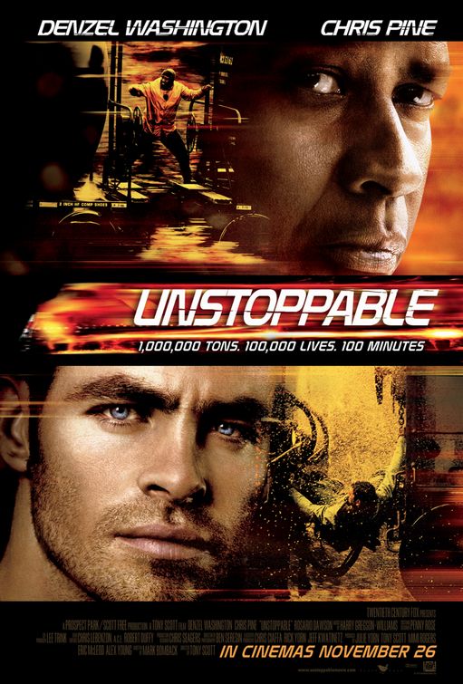
For the title which is in the middle of page, which is unusual for what I have seen. But it is cleverly done, as if it is a speeding train on fire, clever!..
As what seems the norm in lots of posters I've seen the main characters are at the top.. In the same font as the title
The images used are enthralling and exciting, mixing the main characters (clearly with loads of make up and photoshopped) up with the action shots, the use of the characters not only show who they have managed to pay to do be in the film, but it adds emotion to the poster, which draws the audience into the story. And as its based on a real life story (apparently). It gives a more appealing look rather than just a top production company doing a big explosive film.
And has all the writing no one reads at the bottom.. Along with the due date..
Thats all from me for now folks. MS
No comments:
Post a Comment