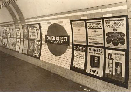
Something a bit like this. ( I know its an old pic, but it shows the general idea)
They liked the style of font that they used, and commented on its consistance and suitability to the poster.
They also liked the effect that the had used, which made the effect on the cloud look effective for the poster.
The feedback me and Conor gave (but not noted)
We felt there should be some bit of colour, we suggested that maybe the red flashing light of the bomb should be at the bottom (in the dark middle bit).. which could like give a little glow to some of the writing at the bottom, which will give it that extra something.
As Patrick has already noted about, we said about having an action shot, but didnt go into further about it. We suggested an action shot, to show the audience what type of film it is, to give excitement and tension to the poster. We suggested shots such as like the main MI5 agen (the protagonist) in a running motion, but this could still be a silhouette in just one colour, to stick with the theme.. Or it could be like a a speeding car, the brief case, just something to give a little about the storyline away.
The big group of text in the middle of the poster should be moved to somewhere not at the center of the picture, which draws the audience to that, which isn't very important. On posters normally its like tucked away at the bottom, so it includes it but the audience isn't drawn to it.
But overall I thought it was a very good first draft for the poster.. Defiantly the use of the background!.. Which I'm sure will be in the final poster.
Written up on behalf of the whole group.. MS


No comments:
Post a Comment