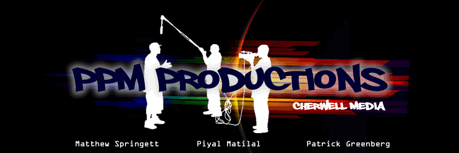
Last media lesson with Mr Wroe we showed our poster to the class and got feedback on it. I was generally quite happy with the comments we had and I now have a good idea where to take it now to improve it. The comments we had were:
- "One of the taglines is all in capital letters whilst the other only has the first letter with a capital!
- "Should mix a tiny bit of colour into it"
- "Add another image into it, possibly an action shot"
Piyal and I will take these comments into account when we meet again to re-think the posters design.
PG and PM

No comments:
Post a Comment